Topics
- Topics
- Review Sessions:
- Grades
- Labs
- Discussion Boards
- Topics:
- Aug 24-Sept 7: The Promise of Big, Open Data
- Aug 31-Sept 7: The Perils of Open Data
- Sept 9 - Sept 16: The Best of R
- Sept 17 - Sept 23: Data Visualization
- Sept 24 - Sept 30: Bad Graphs
- Oct 1 - Oct 7: R Graphics Packages
- Oct 8 - Oct 14: Do you Data Science?
- Oct 15 - Oct 21: Useful Data APIs
- Oct 22 - Oct 29: Managing with Data
- Oct 30 - Nov 11: Can Government Play Moneyball?
- Nov 5 - Nov 18: Open Innovation
- Course Overview
- Class Roster
Review Sessions:
Attend in-person sessions at the following times and locations:
Wednesday, 6pm-7pm
- Meet in UCENT 580A all semester
- We will not meet Oct 31st or Nov 21st
- If after 6pm, take elevator to 4th floor, turn right, take first stairs to 5th floor
Thursday, 1pm-2pm
- Most weeks we will meet in UCENT 480A
- Thursday, Nov 15th we will meet in UCENT 705
- We will not meet Nov 1st or Nov 22nd
Grades
Your grade is comprised of the following:
- 60% - Weekly labs
- 20% - Final project
- 20% - Discussion boards
Labs will give you practice with the key concepts and functions of the week. They are graded pass-fail and you get to drop one lab (chances are you will have one rough week this semester). To pass you need to get at least half of the questions correct and demonstrate that you understand the material.
This grading system is designed as a way for you to focus on the big picture each week and not worry if a specific function or model is not working properly. Computer languages can be unforgiving in the sense that one minor error can prevent the program from running.
Learning a programming language is a lot like learning a natural language in that it is easy to become conversant enough to find your way around a city and order some food at a restaurant, but much harder to become fluent. The goal is for you to become conversant in R by the end of the semester so that you can begin using tutorials and discussion forums to further your journey.
The YellowDig discussion boards are used to introduce you to the data science ecosystem. We cannot cover a lot of topics in-depth, so the discussions are a chance to explore some resources or reflect on a specific article. You need to earn at least 100 points through the semester by posting topics and interacting with peers. The points are earned as follows:
- 5 points for a new pin with at least 50 words.
- 2 points for a comment made to another pin.
- 1 point if you receive a comment on your pin.
- 1 point for liking another pin.
- 5 points if you earn an instructor badge for an informative post.
- max of 20 points can be earned each week.
- 100 points or more earns you an A for discussions.
The final project will require you to practice skills from the semester by building a basic dashboard.
Labs
| DUE DATE | TOPIC | READING | LAB | DATA |
|---|---|---|---|---|
| Aug 24 | Markdown Documents | CH1 | LAB 01 | no data |
| Sept 2 | Functions and Vectors | CH2 CH3 | LAB 02 | PARCELS |
| Sept 9 | Logical Operators | CH4 | LAB 03 | PARCELS |
| Sept 16 | Descriptive Analysis | CH5 CH7 LECT5 LECT7 | LAB 04 | PARCELS |
| Sept 23 | Visualization I | CH9 EXAMPLE | LAB 05 | Schools |
| Sept 30 | Visualization II | CH10 CH11 | LAB 06 | Lahman |
| Oct 5 | Visualization III | DEMO | LAB 07 | Lahman |
| Oct 14 | Dashboards in R Markdown | LAYOUTS | LAB 08 | Lahman |
| Oct 28 | Data IO (input, output) | Tutorial | LAB 09 | CRASH DATA |
| Oct 28 | Joining Data | None | LAB 10 | NONPROFITS |
| Nov 21 | Maps | Overview | LAB 11 | CRASH DATA |
| Nov 21 | Data Wrangling Practice | Review DPLYR | LAB 12 | CRASH DATA |
| Nov 18 | Crashboard Dashboard | Work on Final Project | INSTRUCTIONS | CRASH DATA |
| Nov 25 | Thanksgiving Week | Work on Final Project | ||
| Dec 2 | No New Topic | Work on Final Project | ||
| Fri. Dec 7 | FINAL PROJECT DUE | DASHBOARD |
Labs are worth 60% of your grade. They are graded pass-fail. You get to drop one lab.
You will submit labs via Canvas at http://canvas.asu.edu.
Discussion Boards
Discussion boards are worth 20% of the final grade. We will be using Yellowdig, accessible from the link below:
Or on our Canvas site:
Yellowdig is a Facebook-style discussion board that is organized different than traditional boards that are centered around threads on topics. Instead it has a feed where students create “pins” based upon the topic that week. You receive points for posting pins, for the resonses that you get to your ideas, for interacting on other students’ pins, and when you receive accolades from students or the professor. In this way, it measures engagement rather than word counts used on traditional discussion board (if you post a bunch of long and boring blogs no one will respond to your pins).
The labs in the course focus on the technical skills of data science, so these discussions are meant to balance the class with an opportunity to explore some interesting topics and trends in technology and society. They are open-ended as a means to invite curiosity and critical thinkings.
Topics:
| DATES | TOPICS |
|---|---|
| Aug 24-Sept 7 | Promise of Big Open Data |
| Aug 31-Sept 7 | Perils of Big Open Data |
| Sept 7-Sept 14 | Best of R Packages |
| Sept 17-Sept 23 | Data Viz |
| Sept 24-Sept 30 | Bad Graphs |
| Oct 1-Oct 7 | Graphing Packages in R |
| Oct 8-Oct 14 | Your Professional Identity |
| Oct 15-Oct 21 | Data APIs |
| Oct 22-Oct 28 | Managing with Data |
| Oct 29-Nov 4 | Moneyballing Government? |
| Nov 5-Nov 11 | Open Innovation |
| Nov 12-Nov 18 | Smart Cities |
| Nov 19-Nov 25 | Social Media Tools |
Aug 24-Sept 7: The Promise of Big, Open Data
The world is simultaneously generating more data than it has ever before, as well as pushing for policies for making government data more accessible and democratic. These trends and movements is an important enabling aspect of data science, becuse it provides opportunity for real insights that can change our understanding of systems and allow us to hold institutions accountable.
So ignoring potential problems with big and open data for now, read about two interesting cases where big and open data have offered deep insights into city planning and human nature.
“A Data Analyst’s Blog Is Transforming How New Yorkers See Their City”, NPR, Nov 2018.
How a blog saved OK Cupid, FiveThirtyEight Blog, Nov 2014.
ASSIGNMENT:
For your discussion topic this week, find one data-driven blog post from Ben Wellington’s I Quant NY and/or OK Cupid’s OK Trends where you discovered something cool that you did not know, and share it with the group. In your post highlight what is interesting about the example, and what data made it possible.
You can also check out Ben’s Ted Talk, or this short interview.
Aug 31-Sept 7: The Perils of Open Data
Big and open data can generate powerful insights, but with great power comes great responsibility. In some cases, it might create transparency and improve policy. In others it can be used to manipulate populations and distort accountability.
“The Data that Turned the World Upside Down: How Cambridge Analytica used your Facebook data to help the Donald Trump campaign in the 2016 election.”,
This example poses many interesting dilemas. The Obama campaign was celebrated for using data to enhance voter mobilization. One can argue that the Trump campaign simply embraced the same strategy. Are we being unfair to laude one candidate for his data acumen but criticize another for similar tactics? What are the important differences between the two cases?
ASSIGNMENT:
For your disccusion this week, post a pin with some thoughts about the potential downside of big & open data, ethics in a time of big data, and what sorts of privacy rules you would devise to balance the benefits that can come from access to data along with challenges of data governance.
Sept 9 - Sept 16: The Best of R
You might not have heard, but nerd is the new black, data science is the sexiest job of the 21st century, and there is nothing hotter than learning R.
But what is R, and what are the nerds cool kids using it for?
This week, your task is to explore a few blogs about tools in R and find one package or application that you are excited about. It can be an analytics package, a graphics package, a specific application, or otherwise.
Mine, personally, was the package that allows you to create comic strip graphics in R:
Be warned up-front, this assignment might be overwhelming in you are wading into a new community where the technical language is unfamiliar and the volume of information vast. There are currently over 13,000 packages available in R! That is partly the point of the assignment - recognizing the sheer volume of creativity surrounding the R community. But also learning how to find some sources that make the content accessible. Here are a few to get you started:
Sept 17 - Sept 23: Data Visualization
To kick-off our data visualization segment of the course, this exercise is designed to introduce you to some cool data visualizaion communities.
Makeover Mondays is a weekly exercise where an organization shares a mediocre visualization and the data used to create it, then volunteers from around the world work to create a more informative or compelling visualization.
For your post this week, please select one graphic from their Gallery, post it to YellowDig, and explain what you think makes the graphic compelling? What works? Specific, how did the creators use graphical or design elements to generate insight from the data, create a story, and leave the viewer with a clear take-away?
Sept 24 - Sept 30: Bad Graphs
There is a lot of science behind data visualization, but the art to storytelling with data can be hard to distill into a few basic principles. As a result, it takes time to learn how to do it well. The best way to develop data visualization skill is to regularly consume interesting graphics. David McCandless is one of the best ambassadors for the field of graphic design and visualization. Check out his TED Talk, and some excerpts from his book Information is Beautiful.
Unfortunatly, it is much easier to create tragically bad graphics than it is to create good graphics. For your blog this week, read the Calling Bullshit overview on proportional ink and misleading axes to develop some sensitivity about misleading graphics.
Find a graph that violates one of these principles, or commits an equally egregious visualization crime. Share the graph and explain what offense has been committed. You might start by searching for “bad graphs” on google.
This use of clowns in bar charts is one of my favorites. You might also enjoy pizza charts or these gems.
Oct 1 - Oct 7: R Graphics Packages
For labs thus far we have used the core R graphics engine, but we have not utilized some of the many useful graphics packages in R. This discussion topic offers an opportunity to explore some options.
Your task is to select a specialized graphic that you could use in your own research or professional life, then describe what data or topic from your own work the visualization would be useful for. Reference what R package you would need for the task.
For example, I might say that I work creating budgets for a government organization. I could use a Sankey Diagram from the D3 Package to visualize our budget.
You will find sites like the R Graphs Gallery and The Data Viz Project helpful.
Oct 8 - Oct 14: Do you Data Science?
Planet Money had a fascinating podcast about the rise and fall of women in computer science (you can see a short written synopse here).
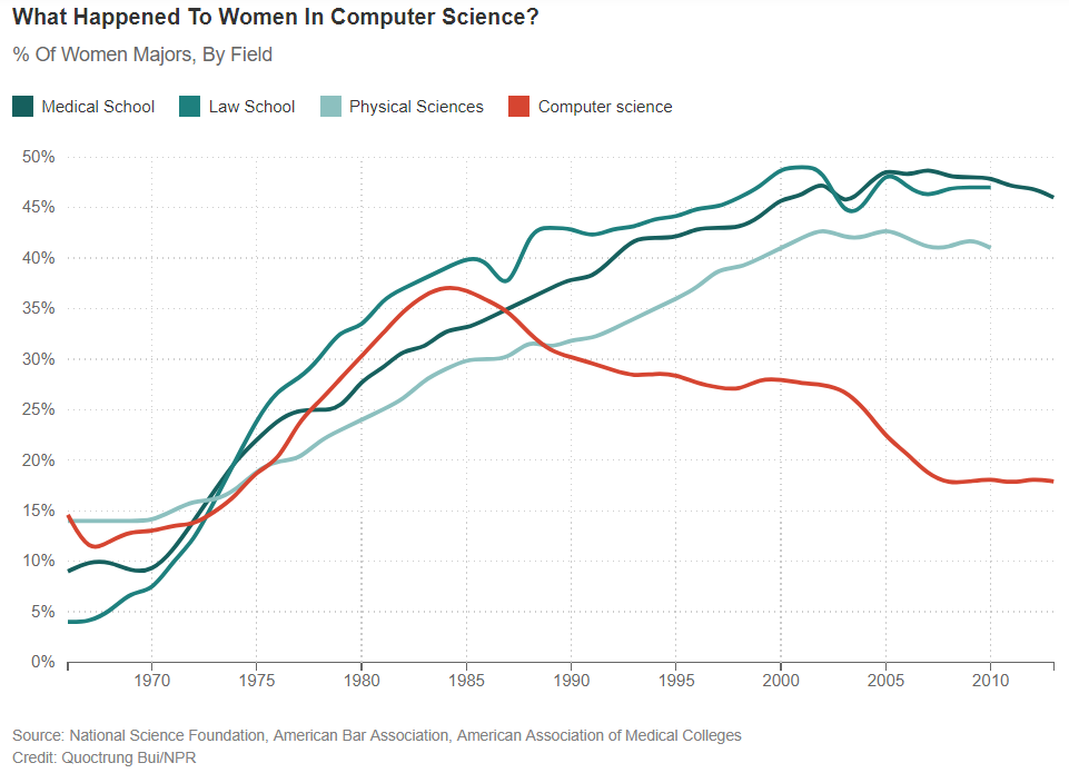
The part of the story I found most fascinating was the schools that were able to turn the trend around using a few simple rules, and create computer science programs that were 50% women. Start at minute 13:00 to learn how.
Most of you are social science or humanities students without a lot of background in computer programming. What has your experience been in this course? Would you have taken the class if it had been called “computer science” instead of “data science”? In the podcast women were marginalized in the field of computer science. The modern version of this story is public sector workers and nonprofit managers that are constantly told that they are not good with data, that they should rely on outside “experts” for this work. Based on your experiences this semester, how can we overcome these stereotypes to make government and social sectors more data-driven and more effective?
Update: R Ladies is Making Data Science Inclusive
Oct 15 - Oct 21: Useful Data APIs
Part of the reason data science has grown so much as a field in recent years is because of advances in computing technologies that allows us to run powerful programs and to work with large datasets on our own machines. But another important reason is that data has become so ubiquitous and cheap, but paradoxically also more valuable for organizations.
Your skill level in data science can be measured by how quickly you can take a real-world problem and produce analysis that offers better solutions than the status quo. Analyzing the data is important, but the process of obtaining data is not a trivial step. Having knowledge about where to look for data, or how to augment your existing data, will help you be more effective as an analyst.
This section in the course focuses on finding data and getting it into R. You can always download datasets from standard sites like the US Census, then import whatever file type is provided into R using import functions. Alternatively, you can use an API.
API stands for “Application Programming Interface”, which is computer science jargon for the protocols used when two applications speak to each other. If you are using your mobile phone and you want to log into your bank using an app, an API will allow you to send your user credential and password to your bank, and will return information about your balances and transactions. APIs are just structured ways of sending data back and fourth. They create templates that allow the user to ask a question or a “query” (e.g. what is my checking account balance?), and the application to send an answer.
In some cases, organizations that host public datasets have created data APIs. In these instances the user asks for a specific dataset, and the app sends a file as a response. To see some examples of how this works, visit the Data Science Toolkit, and test out the examples to see what sorts of data you might access through APIs. In some cases you give some search parameters (such as a zip code), and it returns a new dataset (census data). In other cases, you send data (raw text), and the API sends you a processed version of the data (a sentiment score based upon words in the text). Thus APIs are used both to access new data sources, as well as to clean or process your current data as part of your project.
The good news is that the R community has made a lot of APIs easier to use by creating packages that allow you to use R functions to access data. For example, there is a Facebook package and a Twitter package that allow you to download social media data by sending a request for specific dates and specific users. The R package will provide a function with some arguments for you, which will then translate your request into the correct API format, send the request, then return that data directly to R as a data frame or list. In this way, you can quickly access thousands of datasets in real time through R.
For your post this week, do a Google search and find an example of an API that you might find useful for your work. For example, I use a lot of federal data, so I have found this site to be a useful source of data I did not know existed:
https://theunitedstates.io/APIs/
Altnernatively, you can report on an interesting package in R that uses a data API. Note, you do not have to use the API for the post, just identify what information is accessible through the system.
Oct 22 - Oct 29: Managing with Data
Ever since Michael Lewis popularized the story of the Oakland A’s using data-driven management to overcome huge budget disparities to achieve the underdog story of the decade, every industry is trying to figure out how to “moneyball” performance - i.e. substituting good data for the normal inputs into high-performing organizations like human capital, financial capital, or culture:
Data-driven management can be a double-edged sword, though. Fans of the hit TV show The Wire will recognize the dramatic portrayal of Baltimore’s CityStat system:
As governments and nonprofits begin embracing the use of data to actively inform decision-making, the management practices sometimes need to catch up with the data. The new book The Goldilocks Challenge cautions against jumping right into impact measurement, and instead focusing on management fundamentals first.
Is your current organizations (or one you have recently worked with) collecting data for strategic management purposes? Does it have the proper management practices in place to fully utilize that data that is collected, or is the current data not used to its full potential? If you had to suggest one new data-driven management practice, what would it be?
Oct 30 - Nov 11: Can Government Play Moneyball?
A recent editorial on using Moneyball strategies for government argues that, “less than $1 out of every $100 of government spending is backed by even the most basic evidence that the money is being spent wisely.”
“With so little performance data, it’s impossible to say how many of the programs were effective… Since 1990, the federal government has put 11 large social programs, collectively costing taxpayers more than $10 billion a year, through randomized controlled trials, the gold standard of evaluation. Ten out of the 11—including Upward Bound and Job Corps—showed “weak or no positive effects” on their participants. This is not to say that all 10 programs deserve to be eliminated. But at a minimum, collecting rigorous evidence could help spur programs to improve over time.”
The challenge with this line of reasoning is that outcomes in business and baseball are easy to define. Businesses care about profits and returns on investment, and baseball teams care about wins and championships (or profits and return on investment if you are the team owner).
The trick that Moneyball demonstrated is discovering a key variable that predicts performance, then figuring out how to buy more for as cheap as possible.
What about the public sector? The authors argue that, “According to the Institute of Medicine, more than half of treatments provided to patients lack clear evidence that they’re effective. If we could stop ineffective treatments, and swap out expensive treatments for ones that are less expensive but just as effective, we would achieve better outcomes for patients and save money.”
How do we measure outcomes, though? Take a couple of simple examples, schools and hospitals. What metrics are commonly used to “moneyball” these industries? Are test scores a good measure of school performance? What about hospitals? If you were going to assign a grade to a hospital, what outcome would you measure?
When attempts are made to implement “pay for performance” contracts that only pay for results, it can create a powerful peverse incentive. If you are a high school that only gets paid for students that graduate, you face two stark choices. Either you stop admitting students that are unlikely to graduate (if you have that option), or you can lower standards and fudge numbers. Now you look good on paper, right? But the quality of services has not improved, money was not saved, and we potentially have a vulnerable population that no one will serve because they don’t want to rack up points in the failure column.
For a great example of using outcome scores poorly, see the use of “value-added” analysis in the NY public schools (2:20-4:00) presented by the author of Weapons of Math Destruction:
This is not to say that we should not Moneyball Government, but algorithms that allocate resources or benefits based upon performance will benefit some groups, and punish others. We need to recognize that using data to evaluate performance is an inherently political act that requires transparency and humility. What are some positive and some negative examples of how data has been used to improve government, or to corrupt and distort it?
Nov 5 - Nov 18: Open Innovation
One important feature of scripted analysis is that it is auditable and reproducible, meaning anyone can check to ensure the solutions are correct. More importantly, though, they help to build knowledge. If you have a good analytical solution to a hard problem, but it lives in a file on your computer, the world will not benefit if the solution is not shared and replicated. Once it is represented as a script or analytical “recipe”, it becomes easy to share and for others to reproduce similar solutions in other contexts.
Every community is unique in one way or another, but we all have a lot in common, especially when it comes to local government and the challenges of keeping communities solvent and thriving. If one community devises a clever data-driven solution to a hard problem, it does not make sense for other communities to reinvent the wheel. They should build off of current advances.
Building data science capacity in local government creates opportunity to leverage open innovation best practices. For example, consider these two cases:
CASE 1: The city of Chicago lacked resources to send food safety inspectors to visit every restaurant each year, so they would randomly select a sample as a means of ensuring there was some level of accountability. The data science team began to ask the question, would it be possible to prioritize inspections by the likelihood that a restaurant has a serious violation that could result in a public health problem? They built a model in R using open data that any large city would have, tested it, then share their solution and their source code.
CASE 2: Infrastructure maintenance is one of the most expensive activities any city undertakes, so any management improvements that can reduce project costs by a few percentage points result in millions of dollars in savings. Streets maintenance presents a specific opportunity since timely maintenance at the point where roads begin to deteriorate can extend the life of the road for a fraction of the cost it takes to repair after it has deteriorated too much. The problem is that it has historically been hard to gather data on street quality to know when maintenance should occur. Because of advances in sensing technology timely, high-quality data is no longer hard to collect. But having lots of data poses a new problem - optimizing a maintenance schedule is a hard analytical problem that typically required paid experts that run complicated math models. Some cities have started using open source software like R to create their own programs, and are sharing the solutions for other cities to use and improve upon.
For this topic, think about some challenges that your specific neighborhood or city face that might have a data-driven solution, and that could be easily replicated in other neighborhoods or cities if the solution was represented as an analytical script. If you had a team of data scientists willing to build some tools, what issues would you suggest, and what data would be needed for the solution?
Course Overview
Welcome to Intro to Data Science for the Social Sector. This is a broad overview course designed to expose you to common and useful open source tools in the field.
A few notes about the semester:
Rules for Success
Learning a new skill like R programming is never painless, but you can follow a few simple rules to succeed at this course:
- Find a study group.
- Work until you get stuck, then post a question to the discussion forum.
- Schedule office hours when needed.
- Attend weekly review sessions
Data Science Applications in the Social Sector
It is always helpful to motivate a topic with an example. I like this case study of change that occurred when the Philadelphia police began transitioning from managing a department using instinct of senior officers to using data to identify areas of high need and most effective practices.
What is Data Science?
“A data scientist is a person who should be able to leverage existing data sources, and create new ones as needed in order to extract meaningful information and actionable insights. These insights can be used to drive business decisions and changes intended to achieve business goals… ‘The Perfect Data Scientist’ is the individual who is equally strong in business, programming, statistics, and communication.”
FROM: What Is Data Science, and What Does a Data Scientist Do?
“Universities can hardly turn out data scientists fast enough. To meet demand from employers, the United States will need to increase the number of graduates with skills handling large amounts of data by as much as 60 percent.”
FROM: Data Science: The Numbers of Our Lives, The New York Times
“Data Scientists identify complex business problems whilst leveraging data value. They work as part of a multidisciplinary team with data architects, data engineers, analysts and others.”
FROM: Data Scientist Career Pathways in Government.
Why R?
This course is organized around learning the foundations of programming in R. Although there are several good choices for languages that specialize in data analysis, R has advantages:
- It is completely free and open source.
- It has a large and active user community.
- R Studio has integrated many tools from the ‘data science ecosystem’ so that lots of tasks can be done with a single language, making the return on time spent learning R much higher.
For some background information on R, read the New York Times story: Data Analysts Captivated by R’s Power. Or Check out this 1-minute explainer video:
You will find this background information helpful as you start using R:
See the Resources tab for some additional information about R and R Studio.
Class Roster
Meet your classmates:
Roster for Data Science for the Public Sector, Fall 2018